Mailchimp Top Bar 1.1: bottom position
A few seconds ago, we've pushed out version 1.1 of our free Mailchimp Top Bar plugin, which allows you to show a full-width sign-up bar at the top of your visitor's screen.
Soon after introducing the plugin, we started getting requests from users who wanted the bar to appear at the bottom of the screen. We loved the idea, so we listened.
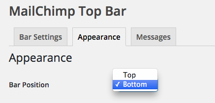
Bar Position: Choose between "top" or "bottom"
After updating Mailchimp Top Bar to version 1.1, there will be a new "Bar Position" option when browsing to Mailchimp > Top Bar > Appearance.

Choosing "bottom" will show the bar at the bottom of the visitor's window. With the default "top" position you could choose between sticky and non-sticky, whereas with the bottom position the bar can only be sticky (meaning the sign-up bar will stay there when you scroll up or down).

Better browser performance, no more jQuery
Another thing we improved upon in this version of Mailchimp Top Bar is the script dependencies the plugin relies on. Previously, the plugin would require the jQuery library which accounts for an additional HTTP request to download the 100 kilobyte script.
We believe the need for jQuery is dying so we decided to ditch it and made sure the plugin only makes use of plain JavaScript. No functionality was lost, the bar will still work great in all browsers, all the way down to Internet Explorer 7.
The plugin will still make use of some jQuery animations if your theme or some other active plugin is still loading jQuery, which most of the time is still the case.
Update now
Besides the improvements described above, we added a new translation (Lithuanian) and introduced a new filter which allows you to set the Mailchimp list that the bar subscribes to.
Updating is super safe, as usual, so please don't hold back! :)